Project details
Loft 8 Logo Design
Grandhome Development
Logo Design
Miint Design
Category
Branding & Logo
Loft 8 Logo Design for GrandHome – Modern, Premium, and Minimal Branding
Loft 8 Logo Design for GrandHome
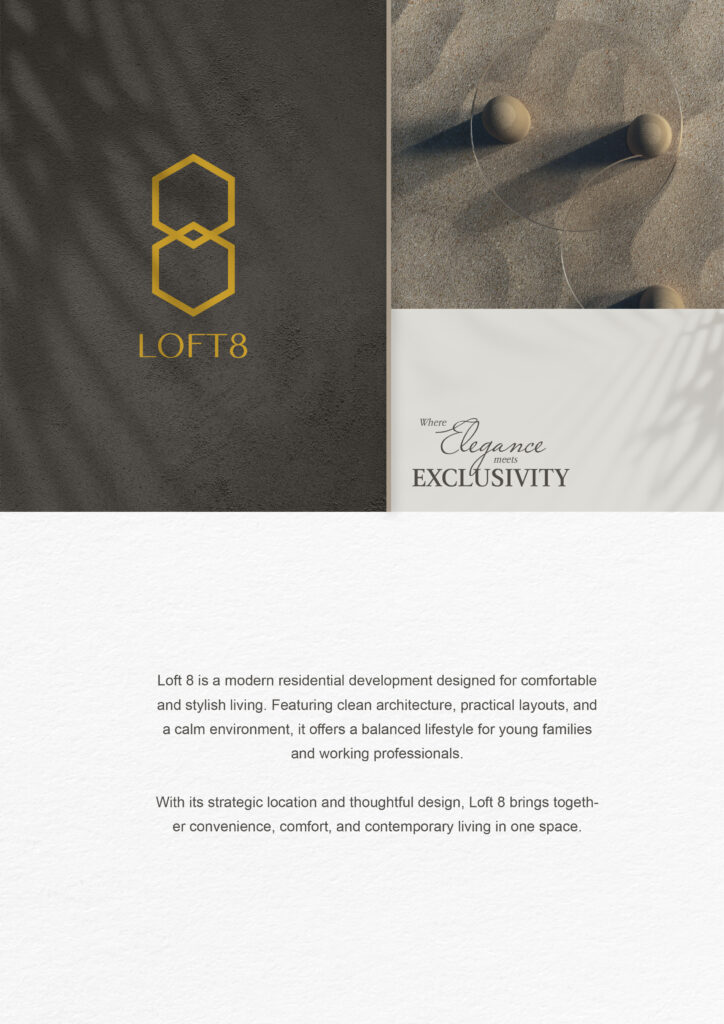
The Loft 8 logo design for GrandHome represents a blend of modern lifestyle and strong architectural identity. We created the logo using clean geometric lines, and this approach brings a fresh and premium look.
It also reflects GrandHome’s vision of building stylish and high-quality living spaces.
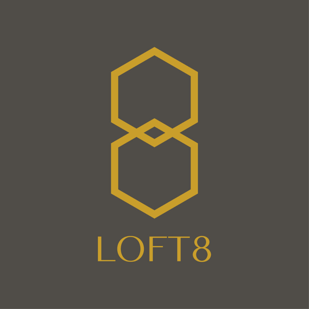
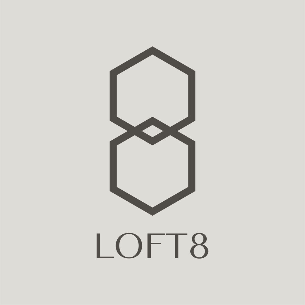
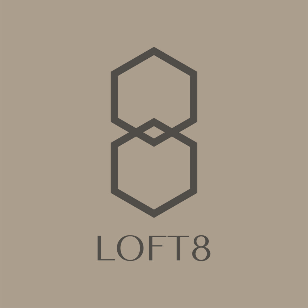
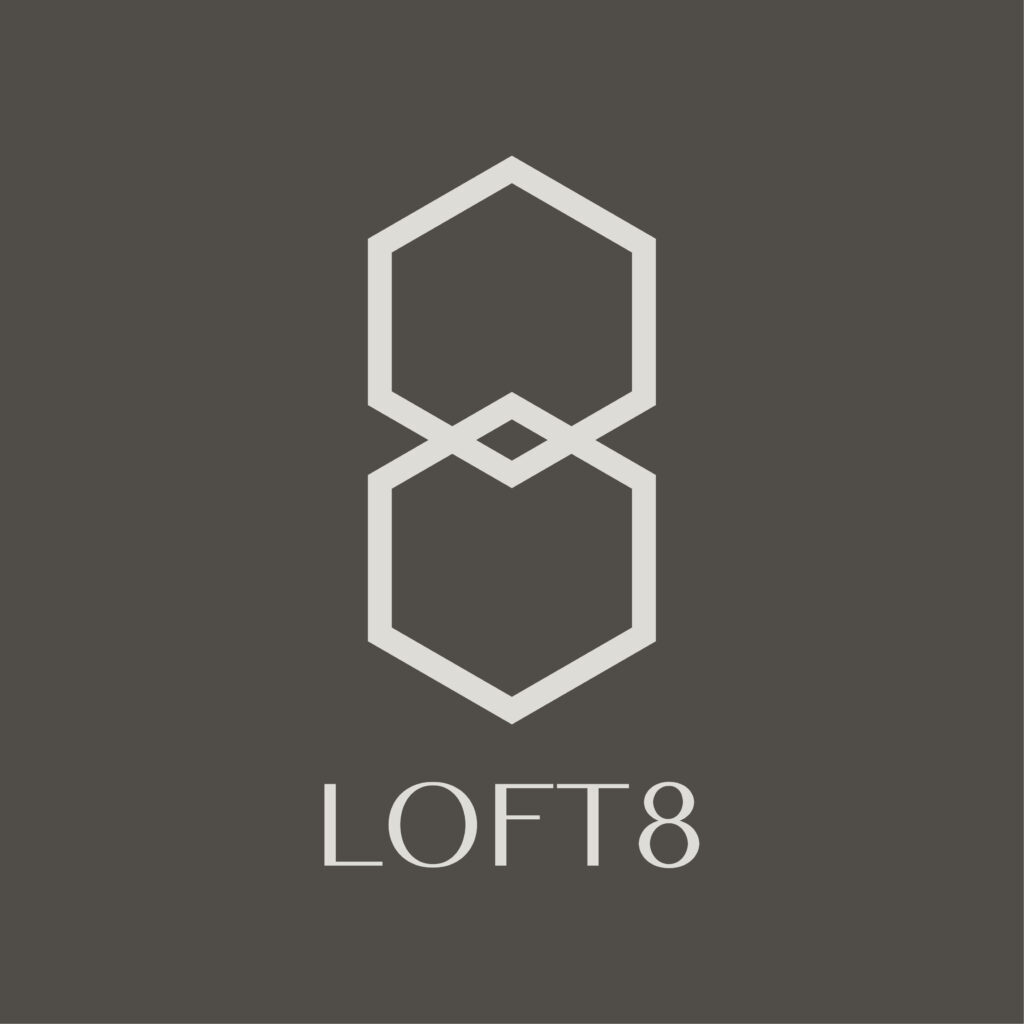
Strong Geometric Concept
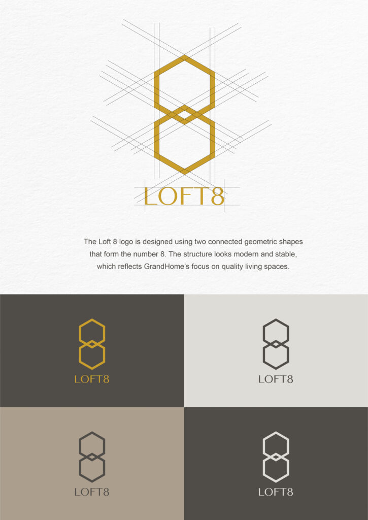
First, we started with the number 8, a symbol of balance, continuity, and prosperity. Then, we transformed the number into two connected hexagon-like shapes.
This structure creates a bold silhouette that feels stable and confident. The clean geometry also makes the logo easy to recognise from far away.
Modern and Minimal Look
Next, we focused on achieving a minimal and neat design. We used a single-line stroke to form the entire symbol, so the logo feels simple but still high-end. Because of this, the overall appearance becomes timeless and works well in many types of applications—such as signage, print, and digital media.
Perfect for Property and Lifestyle Branding
Furthermore, the logo works very well for real estate marketing. Its sharp and simple shape makes it easy to scale, so it remains clear on brochures, billboards, uniforms, and digital ads. Most importantly, the design helps GrandHome build a strong and memorable brand identity in a competitive market.
Conclusion
The Loft 8 logo design delivers a modern, minimal, and premium look that aligns with GrandHome’s brand vision. With its geometric structure, strong colour, and clean typography, the logo creates a professional identity that stands out and communicates quality at every level.