Project details
DeliverNGo Flyer Design
DeliverNGo
Promo Flyer
Miint Design
Category
Flyer
DeliverNGo Flyer Design Concept & Execution
This flyer design for DeliverNGo focuses on clarity, accessibility, and strong brand recognition. From the start, the design communicates the brand’s core service—luggage delivery and storage—using bold colours, clear typography, and structured information flow.
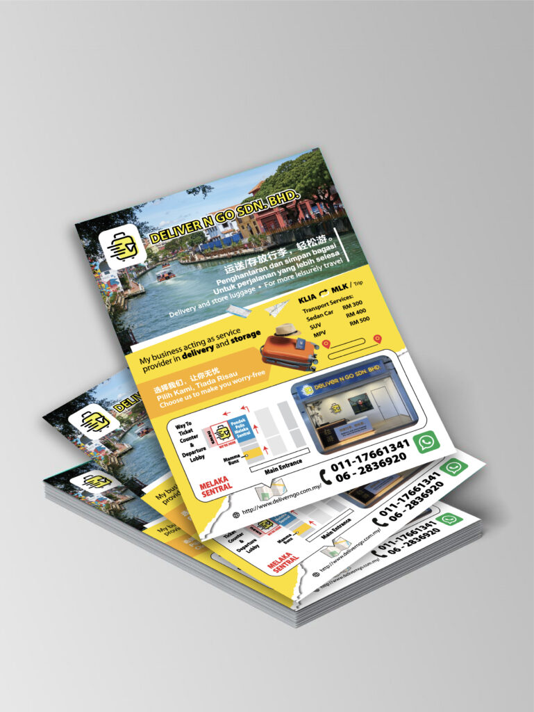
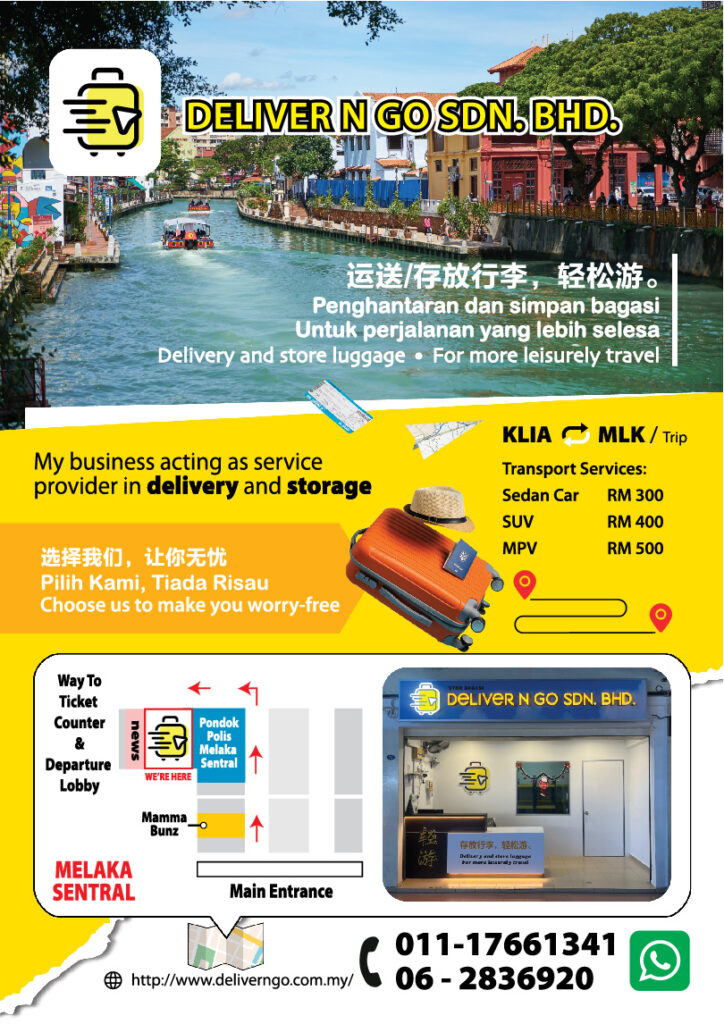
Firstly, the first version (right layout) introduces the service with a lifestyle-driven visual approach. The Melaka river background immediately connects the brand to local tourism. As a result, the flyer creates an emotional link with travellers who want a more relaxed and worry-free journey. In addition, the headline and multilingual copy ensure the message reaches both local and international audiences.
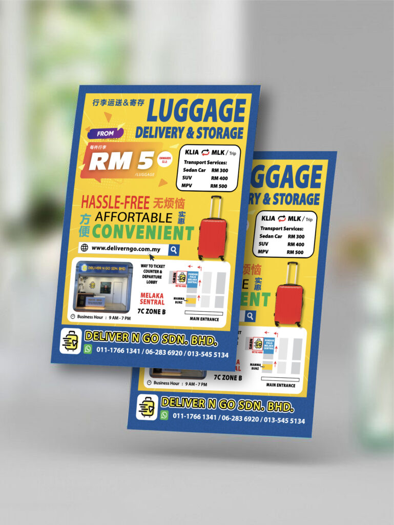
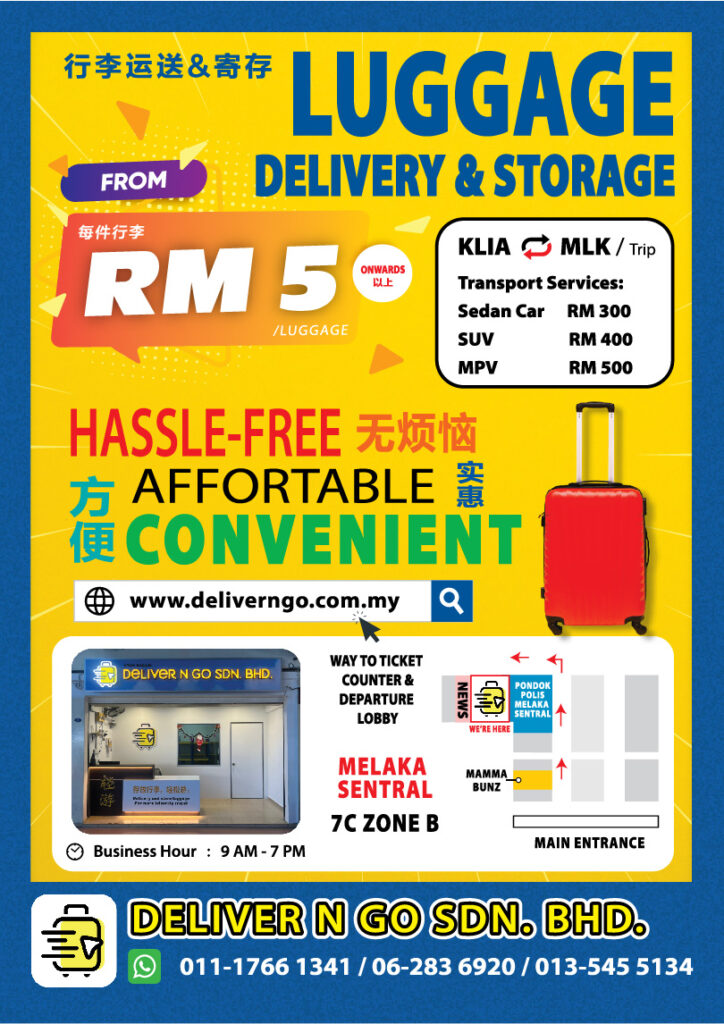
Next, the second version (left layout) shifts the focus to pricing and service details. The bold RM5 pricing highlight draws attention instantly. Moreover, the structured icons, service list, and transport pricing help readers understand the offering at a glance. This version works especially well for walk-in customers who need fast and direct information.
Luggage Delivery & Storage Promotional Flyer
Furthermore, both designs maintain strong visual consistency. The yellow and blue colour palette reinforces brand identity while improving readability. At the same time, clear call-to-action elements—such as contact numbers, website, and location map—guide users toward immediate action.
Most importantly, the layout avoids clutter. Each section flows naturally into the next, making the content easy to scan. Therefore, the flyer not only attracts attention but also delivers information efficiently.
Overall, this DeliverNGo flyer design balances visual impact with practical communication. It supports both brand awareness and customer conversion, making it suitable for counters, tourist areas, and promotional distribution.